Astroneer Wiki talk:Admin noticeboard
~~~~).Version History
I've added a version history page to track the different releases of this game but it needs linking from the main page and I can't edit it.
- Thanks! Great work, I've added it! --Z3ther (talk) 09:41, 19 December 2016 (UTC)
Link Colorization
I've noticed that section titles and links are the same color. I wanted to suggest changing the color of either links or titles, perhaps a slightly lighter shade of blue to avoid confusion. Apologies if this is the wrong place—I actually have no idea who exactly is in control of a wiki's stylesheets!
Infinimbal (talk) 19:45, 20 December 2016 (UTC)
- Sure! Adjusted! --Z3ther (talk) 11:26, 21 December 2016 (UTC)
Page Index
Is there a page index that lists all the pages contained in this wiki somewhere? Ive seen them elsewhere but I cant seem to find it here. I keep coming across different terms/pages for the same thing eg Resource Pods vs Artifacts. I put a post in the forums in the help section at http://forum.systemera.net/topic/2924-wtb-clarification-of-terms-and-things-please/ and am killing time trying to clean up and add consistency and stuff to pages but Id like a little input from the regs/devs so i dont get myself k-lined for stomping on something I shouldnt.
Rkaneus (talk) 21:09, 20 December 2016 (UTC)
- Yes It's here -> Special:AllPages --Z3ther (talk) 11:26, 21 December 2016 (UTC)
I started to create a navbox for items (generator, solar panel, etc), but I want it to be multi level, as
Power
 small
    generator, solar...
  big
    generator, solar panel...
Utility
  ...
This would require the Template:Navbox subgroup. The other solution I found, is using the Template:SimpleNavbox as seen on Minecraft wiki, but this requires Module:ProcessArgs. Can I just simply copy these files here? Asztalosdani (talk) 22:48, 21 December 2016 (UTC)
Discoveries Page
Would appreciate a review of the Discoveries page. Major edit and a first time for me contributing to a wiki. Formatting is probably a little wonky - there may be a better way to align or collapse the images. Also unsure about the classification of some of these as discoveries, or if they belong in the Research Items page. Need advice on the linked Satellite page, as i now reference it as the Hubble Space Telescope - should that page be renamed or left as is? Apologies for the newbness --1ifemare (talk) 16:11, 12 January 2017 (UTC)
- I think as far as content it looks great, I think the images could be more collapsed, similar to how the Research Items page works, that might be a bit better (the collapse +gallery template at the bottom with each of the images in that header (ie: Spacecraft/Space objects gallery) for standardization with a few other pages on the wiki. My thoughts, anyone else? --Z3ther (talk) 16:34, 12 January 2017 (UTC)
- I would also like to see a spoiler alert warning, because let's say the truth, these are easter eggs in the game. Asztalosdani (talk) 17:02, 12 January 2017 (UTC)
- Agree. Any template i can use? Something like this? --1ifemare (talk) 02:15, 13 January 2017 (UTC)
- Sure, that would work. We already have the Template:Ambox, which we can customize with our own colors/image if you'd rather not copy things over. Lemme know if you need help setting it up. --Z3ther (talk) 07:58, 13 January 2017 (UTC)
- Perfect. Thank you. Page is complete to my satisfaction and until further content is added. Feel free to edit out this conversation. --1ifemare (talk) 09:09, 13 January 2017 (UTC)
- Sure, that would work. We already have the Template:Ambox, which we can customize with our own colors/image if you'd rather not copy things over. Lemme know if you need help setting it up. --Z3ther (talk) 07:58, 13 January 2017 (UTC)
- Agree. Any template i can use? Something like this? --1ifemare (talk) 02:15, 13 January 2017 (UTC)
- I would also like to see a spoiler alert warning, because let's say the truth, these are easter eggs in the game. Asztalosdani (talk) 17:02, 12 January 2017 (UTC)
list of Recipes with required resources
I couldn't find a list of all Recipes. If there really is none, I would like to create the Recipes page with a table like this https://docs.google.com/spreadsheets/d/1EddFUEC9KkB_MvYYtdHQ5KEajaviQ9P53PmDGMpwAD0/edit?usp=sharing Armloch (talk) 13:53, 4 February 2017 (UTC)
- Sorry nobody got back to you sooner on this, but I think that would be a good idea to have on the wiki. If you'd like to create it, feel free! The Berk (talk) 06:39, 15 February 2017 (UTC)
Category
I'll start creating category and navigation bars for different tiers of items for navigation purposes, You can hit me up in astroneer forum under the username Lithium for questions Lemonlich (talk) 19:31, 4 February 2017 (UTC)
Quick Game Basics
I'd like to request a small change to this section: The terms Resources and Materials have been merged, so it seems appropriate to un-nest the list items under the Resource heading and remove either it or Materials. --Infinimbal (talk) 18:13, 29 December 2016 (UTC)
- Done! Let me know if there's anything else you'd like to see adjusted --Z3ther (talk) 10:39, 30 December 2016 (UTC)
Front page layout
I would like to suggest it is time for this page to be re-organized. Its purpose is as the entrance to all the information pages of the wiki, and yet this segment is crammed into a corner and cannot even possibly contain the top level hierarchy entries, and what is there is not even representational of the game or the wiki's entire content. Since a picture is worth many words (its a dodgy paint chop-up which sadly is the best I can do atm).
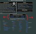
Example new front page layout (rfc1)

There are potentially many ifs and things, and Im not sure about things like if 4 or 5 columns would fit, or how deep in we want to list on teh front page, let alone if the bracket comments to clarify entries is relevant on the front page, but something needs to be done and while discussion/input/refinement is potentially done, other work can continue. Rkaneus (talk) 03:25, 7 January 2017 (UTC)
- Those front page links were never meant to be done, there's quite a bit we can change up. I think if we use 2 (maximum 3 columns) we can change out the "Quick Game Basics" area and sort things around. If you want to flesh out what you think are the top/important 20-30 links from the Wiki Map maybe we can even do pictures and make it look fancy. --Z3ther (talk) 17:35, 9 January 2017 (UTC)
- Assuming that the page layout currently being a mess means it is currently being worked on, the point to my original post of this topic was 'we need to rearrange the sections of this page to flow better and to allow for growth down the line as the numbers of things of equal value that need to be on the front page grow'. Your idea of using images has some interesting possibilities but hte page should still be arranged to flow well and let those arriving find what they need fast.
I think the page should read like this:
- [Welcome to the Astroneer wiki!-this is how much content is located here]
- [About Astroneer block (truncated with ...read more] [Features block](for those who stumble on the place randomly)
- [important groups of information]
- [This is how you can join/contribute to the community]
- All other stuff like the twitter summary etc.
Im not sure about the wisdom of embedding videos directly on the front page as over time more and more people will create their own guides and videos etc (Unless there is an official designated guy, or the vid is done by the devs themselves)
The image idea could be a good one. Take the chapter headings from the wiki-map, make themed/stylized symbols for them and then do "[About Astroneer] [Mechanics] [Exploration] [Resources] [Crafting] " for the [important groups of information] section.
The only suggestions that come to mind for some of these icons are:
- By now the devs should have a logo for the game already so this would be perfect for [About Astroneer]
- A couple gears with interlocking teeth is about my best suggestion for [Mechanics]
- A unit of compound or similar for [Resources]
Rkaneus (talk) 03:14, 16 January 2017 (UTC)
[Moved from Admin Talk] Requesting inclusion of this recently created guide in the respective section on the front page. --1ifemare (talk) 14:27, 14 January 2017 (UTC) Also in that same section recommend removing the bulleting of Resources/Research/Equipment/Tools, for coherence with the formatting in use, since they are not part of any category. --1ifemare (talk) 00:36, 15 January 2017 (UTC)
Adding a request to include Astroneer's Forum and Roadmap on the Portals navigation panel. Don't know if there's any interest in adding the official Youtube, Discord and Twitch... Also think the Community Tools should be featured somewhere (only 2 entries so far, but huge potential for growth there). --1ifemare (talk) 11:12, 16 January 2017 (UTC)
Since my background is in Design (though i'm out of that game now) i thought i'd offer a mockup of my own:
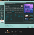
Minimal design alternative

It seems to me most of the stuff on the Main Page is either useless, redundant, or can be merged into other boxes to make it look less like an 19th century newspaper, with all the text boxes floating around. Even the Wiki Community box that i did leave in, has plenty of duplicate links from the navigation panel) - it should be made into a 2 column text box like the Game Basics on the left for coherence and readability (very short line breaks atm). I get the intention is to show that we're busy and there's a TON of content herein, but that's not how this should be approached - make it friendly, easy to read and straight to the point. Maybe add a small box of recently searched or most searched terms for even quicker access. The Quick Game Basics box, i'd just replace with a wiki map with the same content Rkaneus put on the bottom of his layout. --1ifemare (talk) 13:08, 16 January 2017 (UTC)
Change Website Icon Color
I is really unhandy that the color of the A representing the Astroneer Wiki is white maybe a bit greyish because on the favorites bar in the browser (currently chrome) you cant see it. Its a little thing, but should be easy to change. Maybe black thin outline or make the white to grey fade more intense, so you can at least see the bottom part of the A. Then you know: "oh, yeah, there is the A from the Wiki in my bookmarks."
- I think you're referring to the Favicon? if so, I've updated it for you, but might take a little bit for it to show up changed. --Z3ther (talk) 17:35, 9 January 2017 (UTC)
Peach Page Colorization
A Suggestion. The background page colorization decent, but slightly lacking contrast between the peach color and the lighter blue links. The current background color in Hex value is #ECB18F. Could it be lightened a bit to create more contrast with the links? Try a color Hex value of #F2CBB4. It would make the information on the page easier/faster to read. Thanks Davekraftt (talk) 16:44, 11 December 2018 (UTC)
- I've lightened it up some, that should help contrast the links some more. Sdkphoenix (talk) 23:00, 13 December 2018 (UTC)
- That looks much better! I am so grateful. Davekraftt (talk) 00:07, 14 December 2018 (UTC)